Making learning more accessible and more intuitive for humanitarians
Concern Worldwide is an international humanitarian organization delivering life-saving rapid emergency response and life-changing development programmes to the world’s poorest and most vulnerable people.With more than 3,000 employees working in 24 countries, Concern’s Learn365 learning platform is crucial in giving staff key learning content to support them in their roles. The existing Totara LMS had been in use for seven years without an upgrade and was in need of modernisation.The introduction of new learning initiatives, including an improved induction programme for new starters and a management support programme, was the catalyst to press ahead with an overhaul of Learn365.Concern wanted to:
- Undertake a full upgrade to Totara 12.
- Design and build a new theme for Learn365.
- Refresh the user experience to make the site more engaging.
- Simplify key pages to create a cleaner, more intuitive layout.

Flexible learning around the world
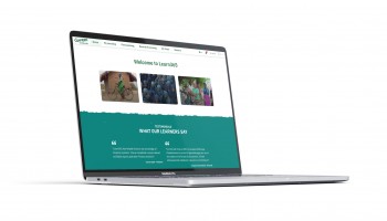
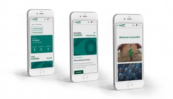
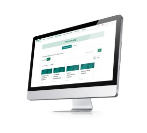
Totara Partner Synergy Learning completed a full upgrade of the codebase and app to Totara 12, which immediately gave Concern access to some important new features that had been added by Totara since Learn365’s last upgrade.Perhaps the most important of these was the addition of offline access to Learn365. Not only does that give Concern staff increased flexibility to undertake learning on tablets and phones, it also opens up more learning opportunities for staff working in countries in which internet connections are not stable. Concern employees in developing countries can now complete courses offline and sync their learning when they are able to use an internet connection.Improvements to site translations have also improved accessibility for Concern learners. Whereas previously individual courses were translated into French, they’ve used Totara language packs to translate the whole site. Concern’s Francophone learners now get exactly the same learning experience in their native tongue as English speakers.The upgrade has also given Concern access to improved reporting features that make it easier for administrators to get the data they need from the site. With all staff required to undertake mandatory training, the updated site makes it far easier to monitor completion levels and maintain compliance across the organization.  Finally, Synergy Learning refreshed the UX design to make the site easier to navigate. By simplifying the pages and dashboard, they’ve made Learn365 more intuitive, with a clearer direction of learning for Concern employees.
Fresher, cleaner, easier to use
The upgraded and improved Learn365 makes life easier for learners and administrators alike. Concern now has greater control over reporting, which makes it less time-consuming to monitor mandatory training.The site was delivered on time and to budget within a relatively short turnaround period to ensure that all of the work fell within the charity’s budgetary requirements for the financial period. The site has received good initial feedback from Concern’s learners.  Employees have found the fresher, cleaner look and improved access make the site easier to use. Concern is expecting that to result in a big increase in learner engagement over the coming months.
“Synergy Learning brought us through the journey really well. Their use of project management tools brought everyone involved in the project together and it was always laid out clearly for us to see how the project was progressing. The most important thing for us was that the project was delivered on time and to budget, and Synergy Learning did that.” – Louise Barry, Learning and Organization Development Adviser


